Wednesday, November 15, 2017
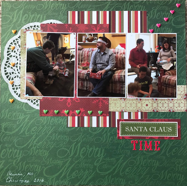
Santa Claus Time
I keep all of my Christmas layout in chronological order. I started this year by putting layouts from our first Christmas time outing with the layouts from the Silver Dollar City Christmas Festival we went to a couple of weeks ago. But doing that I noticed I had very few layouts made from Christmas Day last year. So I started looking back through my pictures and realized the problem was that most of my pictures turned out real blurred. I have no idea what I was doing wrong but they were blurred and dark. But I did find some that I could scrap and weren't too bad so I could fill in some areas from last Christmas.
For this layout I used the new sketch #301 at "SKETCHES IN THYME"
Here is the sketch.
Subscribe to:
Post Comments (Atom)


It's a very nice Christmas page. Love the colors and the interpretation. Eli (Sketches in Thyme)
ReplyDeleteVery pretty layout. The colors are great and I think the pictures are good too. Love the little hearts. Thanks for joining us at Sketches In Thyme.
ReplyDeleteThis is beautiful. I'm in love with the christmas papers and the doily. Thanks for joining us at Sketches in thyme
ReplyDeleteWhat a fun Christmas layout! I love the mini hearts (brads) you used. Thank you for joining us at Sketches In Thyme.
ReplyDeleteLove the doily and hearts! Thanks for joining us at Sketches in Thyme.
ReplyDelete